This case study explores the journey of a prominent education and migration services company as it underwent a brand identity renovation. By redesigning its logo, tagline, typography, color palette, social media templates, and stationery collaterals, the company aimed to establish a compelling and consistent brand image that would resonate with its diverse clientele.
Research
To lay the groundwork for an effective brand identity renovation, thorough research and analysis were conducted to gain a comprehensive understanding of the company, its target audience, market trends, and competitive landscape.
Brand Audit
The first step in the research phase was a comprehensive brand audit. This involved an in-depth evaluation of the existing brand elements. The audit aimed to identify any inconsistencies, weaknesses, or outdated elements that hindered the company’s brand perception and recognition.
Market Research
Simultaneously, market research was conducted to gain insights into the target audience. By uncovering these insights, the company could tailor its brand identity to better resonate with the target audience.
Competitive Landscape
A thorough analysis of the competitive landscape was also crucial. This involved studying direct and indirect competitors within the education and migration services industry. This examination enabled the company to identify opportunities for differentiation and carve out a unique space in the market.
Logo
The logo redesign phase of the brand identity renovation project involved the creation of two variations: one derived from the company’s original logo and the other a fresh concept.
Recognizing the importance of maintaining a sense of continuity and brand recognition, one variation of the logo was derived from the company’s original logo. The objective was to evolve the logo in a way that conveyed growth, innovation, and a forward-looking approach.
The second variation of the logo represented a fresh concept, unburdened by any constraints from the original design. This approach provided an opportunity for a more radical departure, allowing for greater creative freedom and exploration.
Original Logo
Derived Concept
Fresh Concept
Both variations of the logo underwent a meticulous design process, taking into consideration various factors such as simplicity, versatility, scalability, and brand consistency.
Out of the two concepts, the derived concept was chosen over the fresh concept. (ノへ ̄、)
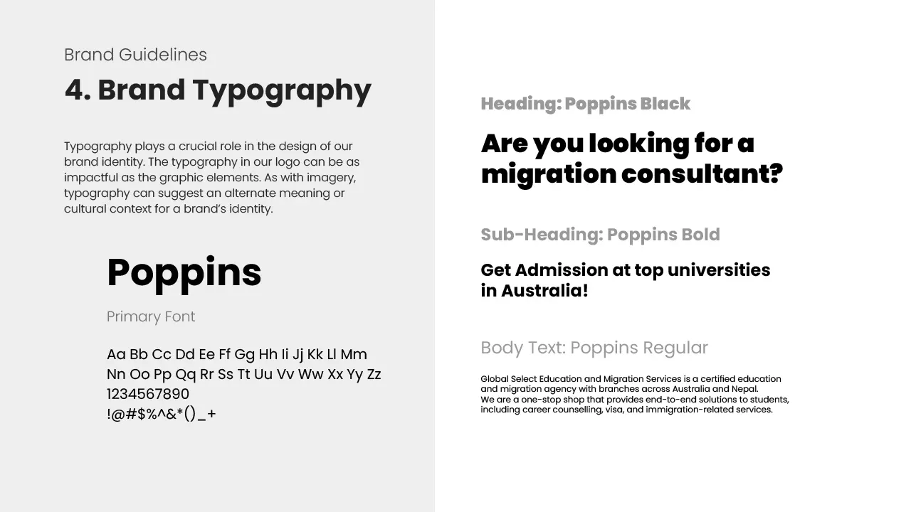
Typography
Typography played a crucial role in the brand identity renovation project, contributing to the overall visual appeal and conveying the desired brand personality. In this section, we focus on the selected typography font, Poppins, and its significance in enhancing the company’s brand image.
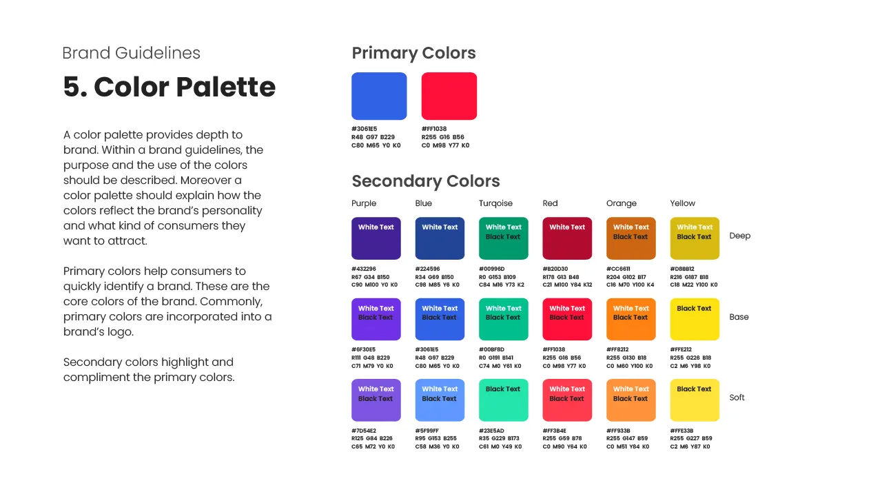
Color Palette
The color palette played a significant role in the brand identity renovation project, influencing the visual appeal, mood, and overall perception of the company.
The primary colors chosen for the brand identity were #3061E5 and #FF1038. These colors formed the foundation of the brand’s visual identity, representing the core essence and values of the company.
To complement the primary colors and provide versatility in visual communication, a set of secondary colors was chosen. The secondary colors consisted of six hues that harmonized with the primary colors and offered a broader range of options for various applications. Each secondary color had up to three variations, providing flexibility in usage while maintaining visual coherence.
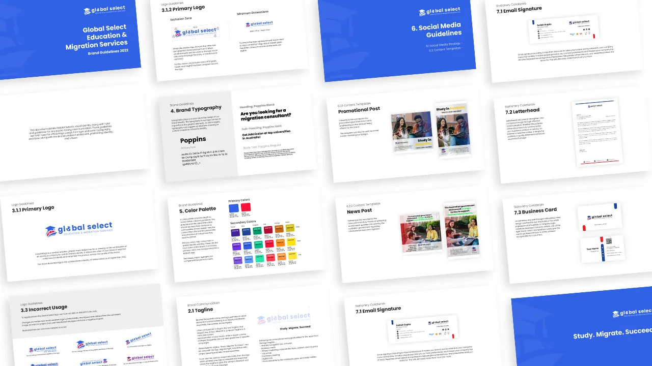
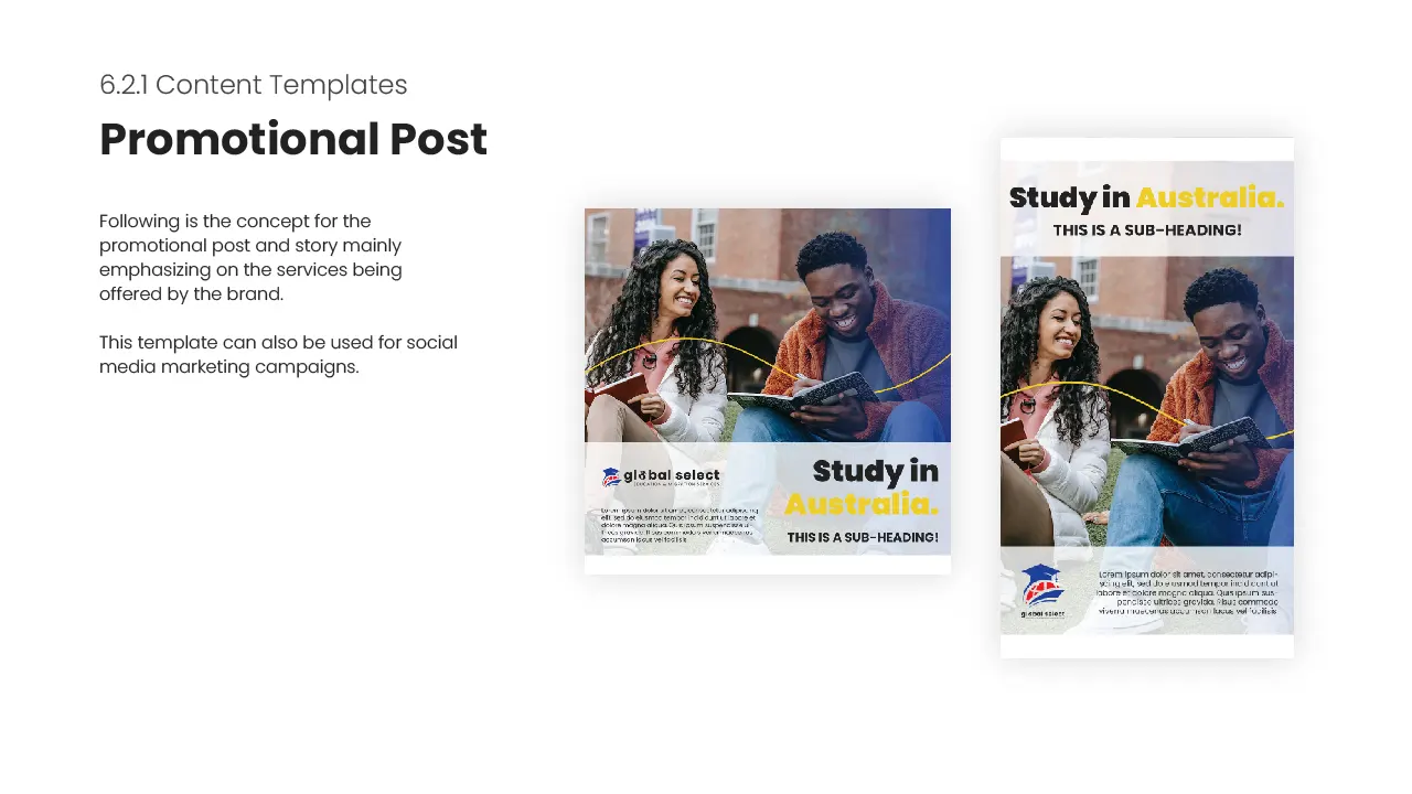
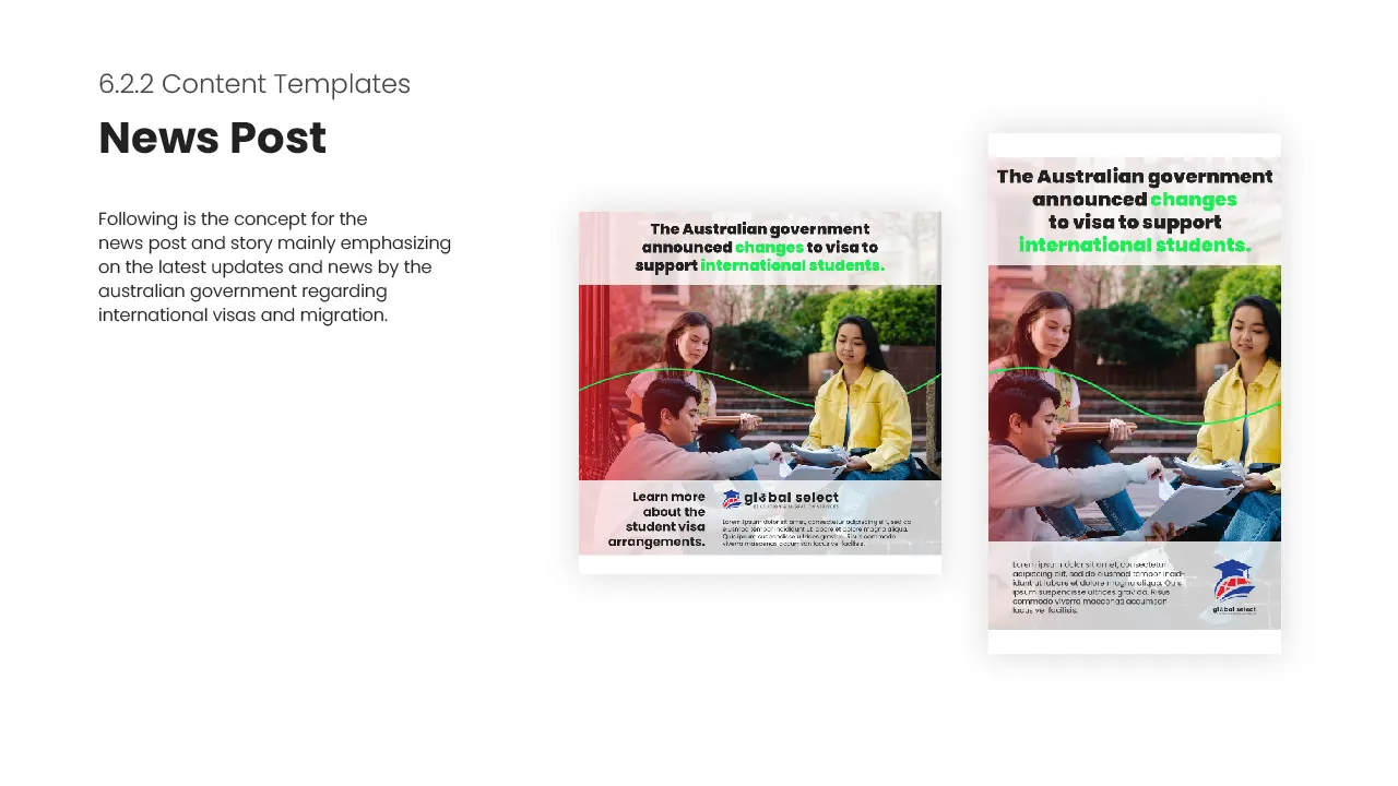
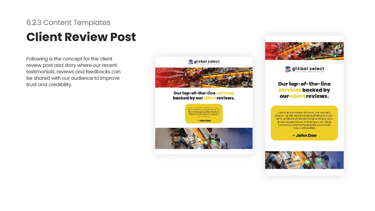
Social Media Templates
As part of the brand identity renovation project, three distinct social media templates were created to enhance the company’s online presence and engage its target audience effectively. Each template catered to a specific type of content, namely promotional, latest news and updates, and client reviews.
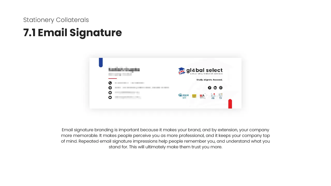
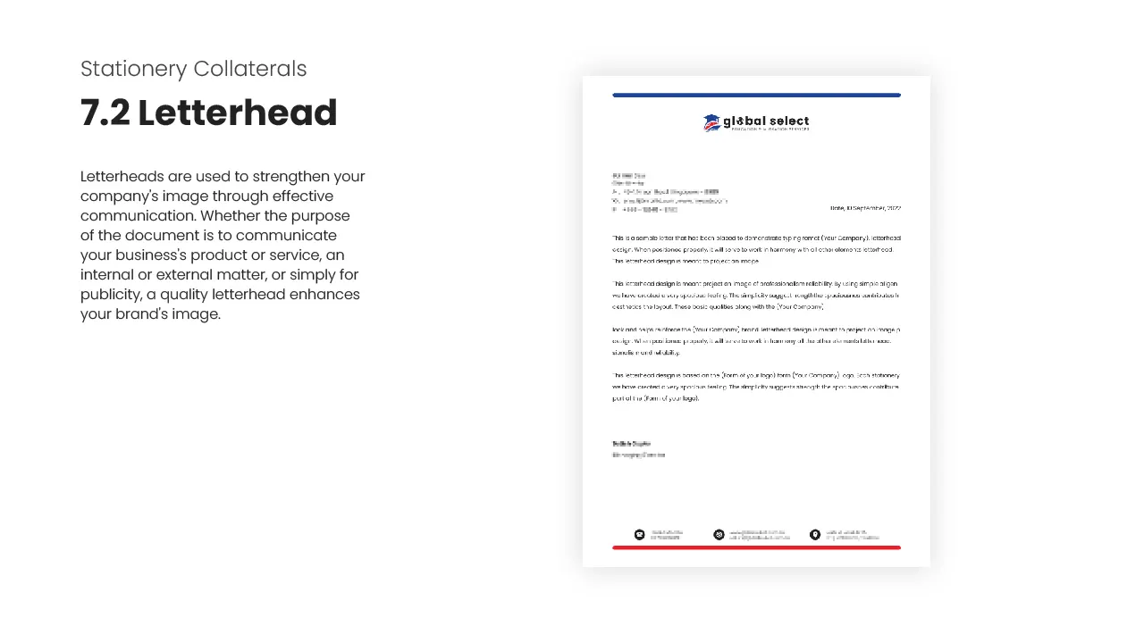
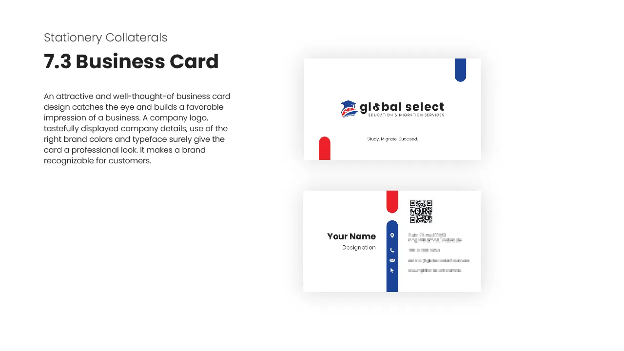
Stationery Collaterals
Stationery collaterals were created to ensure a consistent and professional representation of the company across various online and offline communication channels. The thoughtfully designed business cards, email signatures, and letterheads contributed to a cohesive and professional representation of the company’s brand identity.
Conclusion
Sheesh, this was an extensive project and I totally knocked it out of the park.
If you’re on the lookout for a design genius who can turn your brand into a star, I’m your go-to guy for beyond the box results.